Get to Know: Pink
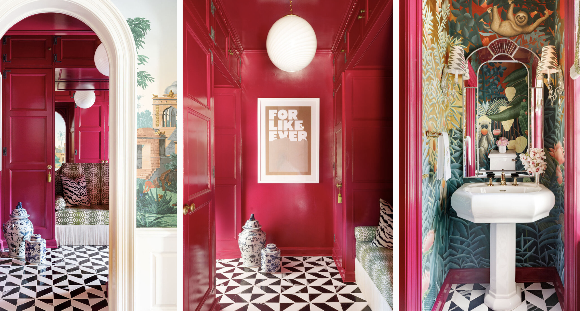
High gloss raspberry coats the walls, ceiling and woodwork
Well, where to start.. how about pink!? For people that already know a little about me, pink happens to be one my faves. My love of all colours is well documented but on a personal note, pink has always been top of the pile. As a child you get asked what your favourite colour is (a lot). I remember taking this question very seriously at the time, even as a 6 year old, and the answer would always be a very enthusiastic “PINK!” Now this might be considered quite an obvious response for a young girl but my love for this cheery, cheeky colour has never wained. It has grown with me over the years, developing and maturing along the way. In the early days a candyfloss wallpaper, courtesy of Laura Ashley wrapped around my bedroom walls, before making way to a more loud and proud Bubble-gum shade in my teens. This also worked it’s way into my wardrobe, in the form of a PVC suit from The Clothes Show… but let’s leave that one firmly in the past!
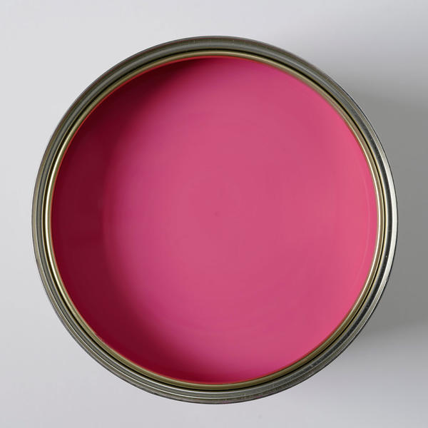
‘Dragon Fruit’ paint from Andrew Martin
These days, my connection to this joyful colour is stronger than ever. My recent re-branding is proof! : ) As with any relationship however, there’s been highs and lows along the way but this experimenting (which I like to think I’ve done on your behalf!), has brought a deeper understanding and greater appreciation. You see, I think there is a general notion that pink doesn’t belong in a grown-up house of someone in there 40’s (hello!). Maybe it’s because we have a particularly strong association with this colour after being introduced to it at such an early age – whether we liked it or not!! By it’s very nature, pink is a hugely evocative colour and will draw a reaction one way or another. Being swaddled in 50 shades of sickly pink can’t be for everyone. Similarly, the ghosts of PVC suits past and garish teenage decor can only evoke cringe worthy memories.
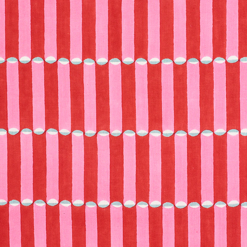
Pink and red fabric from Schumacher
And that’s where most of our relationships with pink end – certainly when it comes to our interior. But that’s exactly what I’d like to address – to move this story forward and reveal how we can bring this rather clever colour into the next chapter of home life. In recent times, our efforts to create a more grown-up backdrop to our homes has revolved around choosing the right shade of grey. If you love grey – great! Stick with it! I too, love a little dash here and there. BUT if choosing this potentially passive shade is more about avoiding the question ‘what else do I do??’… please keep reading!
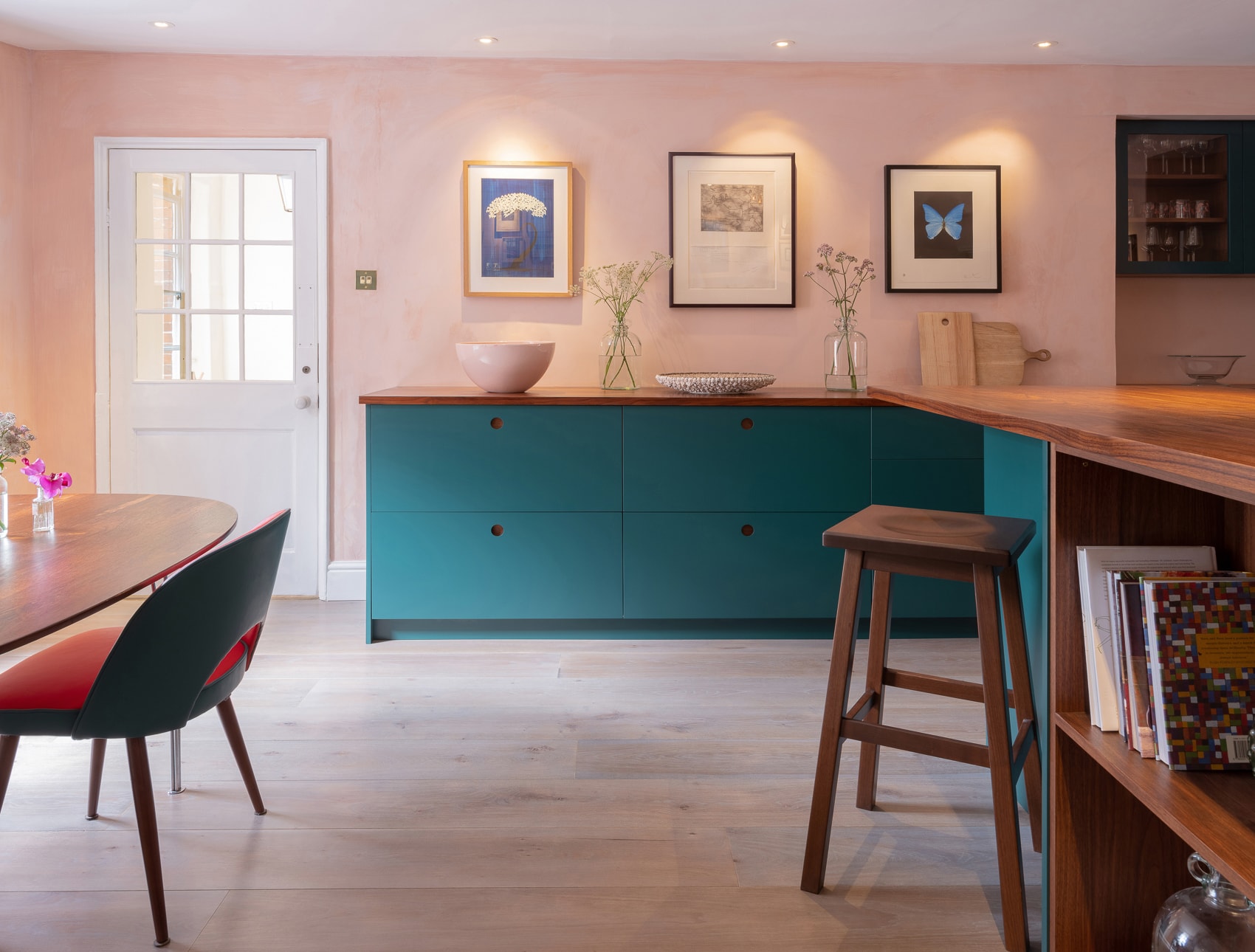
Dusty pink walls blend perfectly with these teal units from Naked Kitchen
There is a perfect place for pink for present day us, it’s just about choosing the right tone and best application. There are so many positive effects attributed to this perky colour. Pink can be sophisticated, cocooning, even calming. (Little fact – did you know police stations have pink cells to help calm it’s inmates?!) Its emotive power is very real, arguably the deepest, emotional influencer of them all. It’s a friendly, welcoming colour and pairs beautifully with so many others.
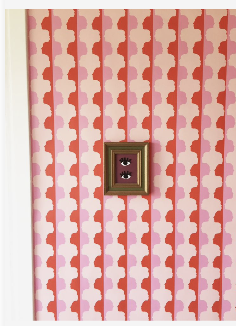
Mirror Face wallpaper design from Etsy
If perhaps you’d like to take this new relationship slow, you can give your home an instant hit of happiness through some simple but effective updates. Introduce a punch of pink in small spaces you’re not ‘living in’, where you know you can be brave. Covering the cloakroom walls in a fun, pinky paper could be the first step. This example of using small areas for experimenting is an old trick but definitely worth listening to. And don’t be afraid to use pattern in a small spaces either!! Lots to be said on that too but I’ll save that ramble for another day.
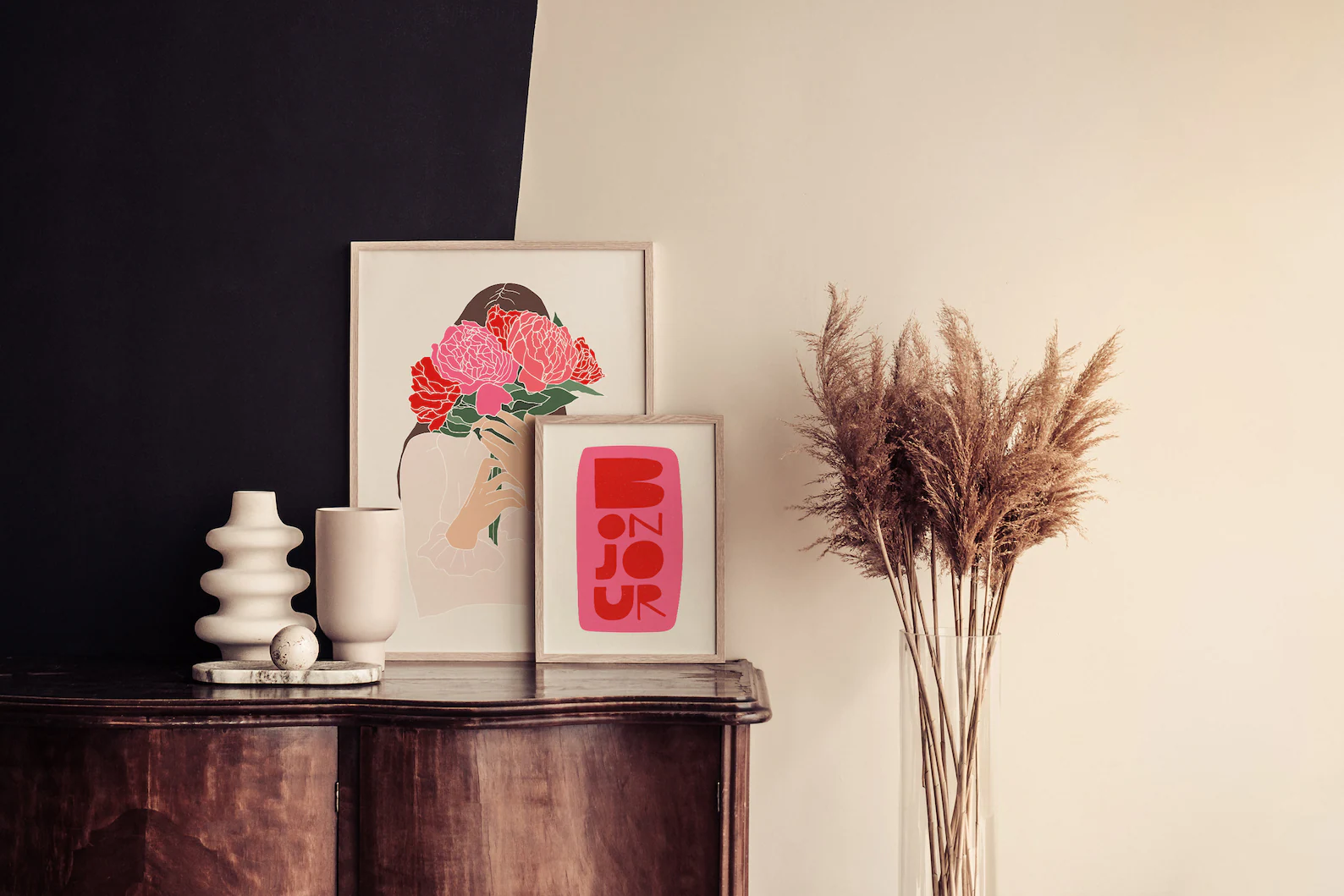
Pink poster accents
Accessories are also a short trip to transformation. There is no avoiding eye contact with pink, it’s one of the colours that really makes itself known. Use this to your advantage by instantly updating existing schemes with cushions, table lamps or an accent rug. It’s where your eye will be drawn to first (especially in a grey room!). As part of my gallery wall at home, I have a pink poster, I’m certain this is the one that makes me smile the most. Pink most definitely carries an element of fun with it, one of things I love most about it. Sadly, I think the fun factor is often confused with being silly or even cheap. This may be in relation to those earlier memories of pink but not so for the modern and more mature scheme. (This circles me back to simply choosing the right shade – the investment in sample pots will be worth it, I promise!!) That pop of pink can also work wonders in a scheme that is starting to take itself too seriously. It’s a way of waking up the senses and conjuring a more relaxed atmosphere when things are feeling a little stiff.
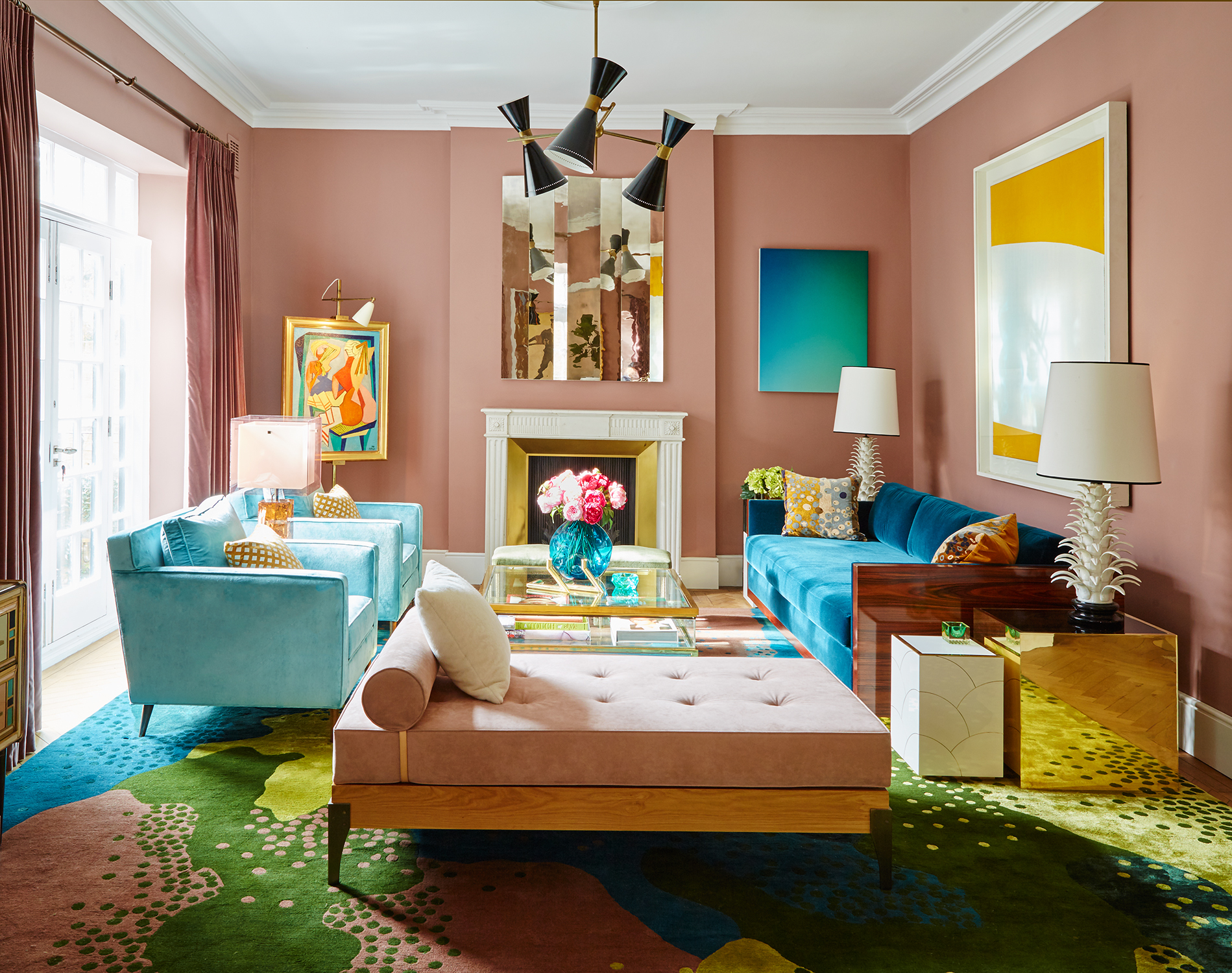
Islington town house by Peter Mikic
If you’re ready to take the plunge and give pink a more permanent place in your home – hooray!! For the larger surface areas such as walls or kitchen cabinetry, I’d be drawn to choosing from a softer or sludgier palette. “Give us some examples!” I hear you say.. How about Farrow and Ball’s ‘Potted Shrimp’, Little Greene’s ‘Blush’ or Fired Earth’s ‘Rose Mallow’ – all gorgeous options. These less saturated pinks are a sympathetic choice where you wish their presence to be known but not to overpower. The greyed down tones will allow you to add additional colours to the scheme, without creating friction.
Don’t stop short of using colour on the walls and then sink back into neutrals for the rest of the room, this will feel jarring and dis-connected. Use the pink as your anchor, always referring back to it when adding new colours.This will help guide you towards a much more complete and cohesive scheme.
By the time you’ve added that final piece to the pink puzzle (I’m hoping it’s the Jacquard Patchwork throw from Kenzo… !) those early feelings of trepidation will be replaced with triumph. You’ll be so busy enjoying this newly accomplished space, that you’ll barely notice that the walls are in fact pink! But that’s exactly what we want – to bring colour into our everyday, in a way that enriches, compliments and provides the perfect (in this case, pink) backdrop to our grown-up lives.
